I found this map on another blogger's page and thought it was very interesting. It shows the most popular social networking websites by country. Not surprisingly, Facebook and Myspace are dominant in Anglophone countries, whereas Europe, Asia, and South America seem to all have their own sites more popular than Facebook!
This particular map I found on Geographer Garry Peterson's website, from a post dated in 2006. It's a map of the world based on population size. China and India (as well as parts of Europe) seem to be grossly overrepresented on this map, as countries with higher population densities tend to be larger than their counterparts. Note how small Australia, Canada, and Russia are!
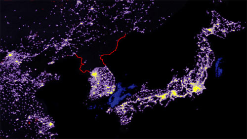
This map is a map of far northeastern Asia at night, which I found from paradoxoff.com. What is interesting about this map is how industrialized and modern South Korean, Japanese, and Chinese cities have become. Yet at the same time, almost the entire country of North Korea is shrouded in massive darkness.

No comments:
Post a Comment